Explaining RRUL Charts
The Realtime Response Under Load (RRUL) test performs accurate, automated, and repeatable measurements of network performance. RRUL is especially well suited to measuring induced latency when heavy traffic is present. This latency is often called “bufferbloat”.
The charts on this page were created by Flent, a Python program that runs the RRUL (and other) tests and creates graphs of the result. This page describes the charts created by the Flent program.
An RRUL test run saturates the network by initiating eight data connections to/from a netperf server at a remote location (four simultaneous connections sending data in each direction). Each connection has a different diffserv class to compare their performance and fairness. In addition, the RRUL test measures latency across the network with ICMP or UDP pings.
The Charts
Flent produces three major types of charts:
- RRUL Three-plot Charts, showing download, upload, latency in three plots
- Cumulative Distribution Function (CDF) charts that show the distribution of latency readings
- Box Plots show a comparison between multiple Flent test runs
RRUL Three-Plot Charts
The RRUL test runs for 70 seconds by default: 5 seconds of idle (to give a baseline), 60 seconds of full-rate data transfer, and 5 more seconds of idle. A three-plot RRUL Chart shows:
- Download plot showing the average download speed (Mbits/sec, in black) of the four diffserv connections (individual colors.) Multiply the average by four to get the actual throughput/link speed.
- Upload plot showing the average upload speed (Mbits/sec, black) of the four diffserv class connections (individual colors.) Multiply the average by four to get the actual throughput/link speed.
- Latency plot showing the average latency (msec, in black) of all the connections.
- Horizontal axis for all plots is seconds, across the test duration.
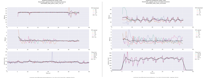
The image above shows two Flent RRUL runs, with good (on the left) and poor latency control (on the right). Here’s what the charts show:
- Good latency control Notice how the black (average) plot shows constant traffic at 4x31mbps for download; upload is constant at 4x2.8mbps, and the latency is very steady around 15 msec. (Full size)
- Poor latency control Although the black download and upload rates are roughly the same, each of the four connections (in color) show far more variability. But most important, the latency jumps up from ~15 msec when idle to 250 msec during the test. This indicates bufferbloat. (Full size)
Note: The measured download and upload rates tend to be lower than the full rated speed of the ISP connection. This is because the TCP Ack traffic uses a significant fraction (often as much as 20%) of the capacity in the opposite direction. This does not skew RRUL results, because all tests will have the same testing conditions.
Cumulative Distribution Function (CDF) Plots
The Cumulative Distribution Function charts (CDF) show the percentage of readings with latency below a certain time. The two charts below show the same test runs as the charts above: one (on the left) showing good latency control, while the one on the right shows poor control.
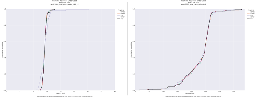
- Good latency control (on the left) Notice that most latency samples are below 15 msec, and nearly 100% are less than 20 msec. (Full size)
- Poor latency control (on the right) A small fraction (a few percent) of the samples are less than 50 msec; 50% are > 250 msec (12x longer); with a long tail that’s greater than a third of a second. (Full size)
Flent Box Plots
In addition to displaying the results of the current run, Flent can save those results for later analysis. The Box Plot displays the result of multiple test runs to provide a comparison.
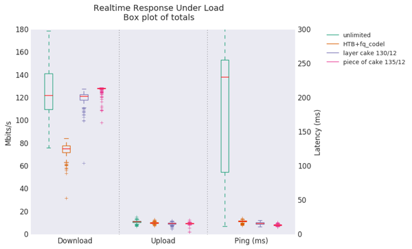
The chart above shows four test runs (Full size):
- No SQM control (green): The (total) download speed averaged a bit above 120 mbps (4 connections at 30 mbps), but the green rectangle indicated that the values between the 25th and 75th percentile varied between 110 and 140 mbps. The dotted lines show the full range of measured values were between 75 and 180 mbps.
- HTB+fq_codel qdisc (orange): The average download was lower: about 75 mbps, but with less variability and latency. (The lowered speed came from the router’s inability to process packets fast enough using HTB+fq_codel.)
- layer cake qdisc (purple): The more efficient layer cake algorithm allowed the router CPU to keep the download rate high while minimizing variability.
- piece of cake qdisc (red): This gave a bit larger download speed bump (~130 mbps), with similar (low) variability.
Note that all four plots show that upload speeds perform at the rated ISP link speed, and the last three qdisc’s (2-4) gave very good control over latency, with “piece of cake” being a slight winner.
Many thanks to Aaron Wood for permission to use images from his blog post about setting up SQM, QoS, fq_codel, and cake. Read more at: http://burntchrome.blogspot.com/2016/12/cake-latest-in-sqm-qos-schedulers.html
Bloat Project
Recent Updates
Find us elsewhere
#bufferbloat on Twitter
Google+ group
Archived Bufferbloat pages from the Wayback Machine
Sponsors
Comcast Research Innovation FundNlnet Foundation
Shuttleworth Foundation
GoFundMe
Bufferbloat Related Projects
OpenWrt ProjectCongestion Control Blog
Flent Network Test Suite
Sqm-Scripts
The Cake shaper
AQMs in BSD
IETF AQM WG
CeroWrt (where it all started)
Network Performance Related Resources
Jim Gettys' Blog - The chairman of the Fjord
Toke's Blog - Karlstad University's work on bloat
Voip Users Conference - Weekly Videoconference mostly about voip
Candelatech - A wifi testing company that "gets it".